


Personal logo and branding using abstract symbols to portray personal story.
Mind Mapping
In order to have a deeper meaning to the final design and logo, mind mapping helped find key aspects of identity in this story.

Key aspects to consider:
Cultural identity; Lakota & Tongan tribal designs.
Symbols of Good and Bad (yin/yang).
Basic Design Characters
S = Sione (First Name)
I = Inukiha’angana (Last Name)
19 = Jersey number in high school. Also, significant for the year 2019. My life changed for the best this year.
Ideations
Begin with abstracting symbols to show initials and number (S, I, 19).


Ideations cont.
Focus on integrating water, Polynesian swell design and waves, and Eye of Horus.


Ideations Rendered
Top 3 focusing on water, tribal designs and basic abstracted letters and numbers.


***Circular design is further refined going forward as it embodies the basic characters S, I, and 19. While expounding the abstract feel of water and both Lakota and Tongan tribal designs.
-

"S" for my 1st initial
-

"I" for last initial and the Eye of Horus. Meaning well being and protection.
-

"19" a significant number in my life.
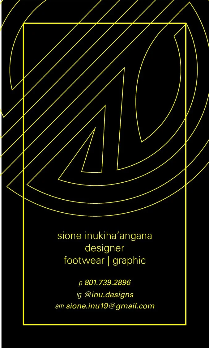
Business Card
Color Study
Traditional business card shape and focus on teal color or other bright spot colors to grab client’s attention.


Business Card
Color & Shape Study
Triangle, Square and Circle as a shape and monochromatic and complimentary colors.
The focus of using teal is from Colorstrology on my birthday and is Caribbean Sea Pantone 18-4525.


Final Business Card
Shape & Color
Colorstrology’s description of Caribbean Sea and how it matches my personality was spot on and used as a monochromatic color scheme.
The circular shape and color is to reinforce the logo and interpretation of water.

